S
K
HealthLife Patient Portal
Problem Statement:
Going to the hospital can be daunting and sometimes scary. As a patient, you hear medical jargon, diagnosis’ you don’t fully understand and a care team you’re not familiar with. HealthLife is a patient-centered application that enhances the healthcare experience for patients by providing easy access to their medical chart, care notes, a personalized care calendar, a patient education portal, a billing portal with patient insurance statements, and an in-app appointment scheduler and reminders for follow up appointments and specialists.
Scope, Role, and Tools:
We spent 3 weeks designing this app. My role within this projects was as a User Interface/Experience designer. The tools we used throughout the duration of this project were Figma, Miro, and Figjam. These tools were useful while collaborating with team members and sharing data amongst each other.
Goals and Objectives:
The goal was to make an app that helped patients easily see their medical information like charts, medications, insurance, upcoming doctor visits, and patient education, all in one spot.
Research and Discovery
Research Methods
This project involved extensive research. To develop an app that incorporated connectivity, automation, migration, and integration in the medical field, we initially examined each of these aspects individually. Each team member focused on one area, conducting independent research online. We then combined our findings and discussed how to integrate them into the app.
User Interviews

We interviewed five potential patients about their past and present healthcare experiences, focusing on how well-informed they felt. Our goal was to understand the challenges they faced when going to the hospital or emergency room. Insurance, medication comprehension, diagnosis understanding, and challenges in securing suitable doctor appointments were topics we covered.
We found similarities between all our interviewees to find main pain points.
Affinity Diagram

On the left you can see quotes from our user interviews. Our demographic for this project was ages from 26-50+. We discovered that users commonly don't understand what a diagnose means when given. We also found that users would rather have a way to easily give their insurance information rather than being interrupted during their visit. Another point that was brought up was users wanting to have access to descriptions and charts in regards to their diagnoses and care chart.
User Personas, Competitor Analysis, and User Flows
User Persona

We created this persona based off of the information we gained through the user interviews and affinity diagram. When it came to creating this user we wanted to focus on the pain points of lack of understanding when a doctor describes a diagnoses and the struggles of balancing a healthy lifestyle.
Competitor Analysis

We initiated our competitor analysis by delving into research on medical charting applications and narrowed our investigation to focus on four specific apps: Florida Center for Hormones & Wellness Portal, MyChart, AthenaHealth and MyHealthONE. We proceeded to assess each app, identifying their respective strengths and weaknesses.
User Flow

Here you can see the user flow chart of the application. We wanted to display how a user may traverse through the HealthLife portal. Some pathways that can be seen above are, moving from the overview page to the billing and travelling to see the insurance information or past invoices.
We hoped to simulate how a user may move and display all possible paths!
Low Fidelity Sketches


This is our low fidelity wireframe where users navigate the tutorial, the main map page, the map filters, and the objectives lists. The users could experience the app as a first-time user would, and experimented with testing the efficiency and the level of comprehensive design.
We made sure to test the wireframes and took the responses into account while making changes
Prototypes

We created a functional, mid-fidelity prototype for testing. We tested 4 users having them test the main functions of the app. Some of the functions they tested included onboarding, scheduling a follow up appointment, viewing their care notes and inputting their insurance information. After the testing we focused on fixing the dead-ends the users encountered during testing
Visual Design
Colors

We looked into the psychology of colors and found the most common colors associated with the medical field. We also referenced other medical apps for inspiration. We subsequently landed on light grey blues and a darker green blue.
Typography

This is the typography we chose for HealthLife. We wanted to focus on readability and accessibility due to how our target audience is patients currently or previously admitted into a hospital. Those of which may have issues and struggles when reading on devices such as tablet.
Icons

We have a couple different types of icons and animations throughout HealthLife. This includes the bottom navigation bar. The top navigation bar and the view and download document icons. We chose the icons to emphasize recognizability which makes our application easier to navigate.
We chose ease of access and recognizability with our icons!
Usability Testing
Discarded part


We decided to make some updates and changes to our bottom navigation bar between the wireframes and the prototype. We changed the book appointment page icon due to testers having difficulties finding it. We also changed the click state to an underline rather than a highlight.
Discarded part


We came to the conclusion that the pop up for translating the care notes page was taking up too much space on the page and wouldn't go away. So we decided to change the way the users interact with it by adding an info icon that opens the pop up when clicked on.
Final Deliverables

Here you can view the most current version of the HealthLife application. Where we have a Chart reader Ai. where a user submits a file or chart and the ai rephrases what the chart says in understandable terms There's also a calendar that connects to your personal calendar and lets you see upcoming appointments or medication refill alerts and our homepage houses a diagnostics chart with a calendar of upcoming events, consultations, medications and education.
Results and Impacts
The impact of our project is increased patient understanding of doctor diagnosis. It also results in decreased missing of medications and a more streamlined way to make payments and access medical care charts.
Challenges and Learnings
One of the challenges that came with creating the application HealthLife was finding what issues to focus on fixing with our application. Which leads to one of our learnings which was how user interviews are extremely beneficial to deciding what pain points to focus on and finding the nitty gritty of what hinders our users. We learned that communicating with patients is extremely important in the medical field and we strived to reflect that in our design, emphasizing transparency and ease of access. This is due to keeping the notes and charts updated through many applications and trying to keep the process easy to understand and use for patients.
Conclusion
In summary, HealthLife is a patient-centric application designed to alleviate the hardships and pain points of users in healthcare encounters. By centralizing medical information and providing user-friendly features like appointment scheduling and patient education, it empowers patients to navigate their healthcare journey with confidence. The project's main goals were to increase patient comprehension of diagnoses, reduce instances of missed medications, and a streamlined process for accessing and managing medical records and payments. Ultimately, HealthLife contributes to a more informed, engaged, and empowered patient community, fostering better healthcare outcomes and experiences.
Promise In Brevard Redesign
Problem Statement:
Promise Brevard is a non-profit organization that provides assisted living facilities and services to disabled adults. Promise relies on volunteers to support their fundraising projects, currently it is difficult to find information on the website related to volunteering. The current website presents potential volunteers with unnecessary challenges that could lead to decreased motivation to pursue volunteer opportunities. How might we improve Promise's content layout and navigation so that the organization sees an increase in volunteer numbers, revenue, and returning users?
Scope, Role, and Tools:
We spent a month designing this website. My role within this projects was as a User Interface/Experience designer. The tools we used throughout the duration of this project were Figma, Miro, and Figjam. These tools were useful when it came to wireframing, designing, and collaborating.
Project Overview:
This Project was the "Redesigning of the Promise in Brevard Website" Which is a nonprofit organization that houses young adults with disabilities. In this project we redesigned and revamped the website to become more user friendly, appealing to the eye, and to increase the amount of foot traffic within the website.
Goals and Objectives:
Our goals were to increase the amount of user traffic that reaches and uses the website. We also wanted to promote the increase of volunteers and users that donate through the website. We hope to increase the support for the residents through this website redesign and we'd like to make the process as easy and enticing for the users as possible
Research and Discovery
Research Methods:
Our research methods were a combination of user interviews, affinity diagrams, and user testing. This proved helpful when it came to iterating and finding any pain points or problems users may have during the process of using our website.
User Interviews

Two users found that the website's design didn't align with the overall aesthetic, with one mentioning that red call-to-action buttons clashed with the design. Additionally, both users noted that the site appeared cluttered and the font choice made it difficult to read.
We made our Affinity Diagram from the information of the User Interview!
Affinity Diagram

We found that a common issues and pain points that our users found during the initial user interview were the illegible fonts, The confusing set up and the issues with finding information on what the website itself is promoting or about
User Personas and User Flows
User Persona
.png)
We created this user persona from the affinity diagram and user interview we conducted. We found that commonly the users displayed a distaste for confusing set ups and misinformation which is a key point we used when creating Barbara Neil an avid volunteer and social media user.
User Flow

We found that users commonly got stuck when trying to locate the Donate section so we linked many options to go to the donate page throughout the website. We also made sure to give the users enough places to go without making them feel overwhelmed with choices.
We wanted to make sure that there are no dead ends within our website and made this flowchart!
Low Fidelity Wireframes
Website Wireframes
We wanted the homepage to be filled with useful information regarding both volunteer opportunities and showing the user what Promise Brevard is about. Within the navigation we wanted users to have easy access to everything including more information and an easy to see and use donation button.
Mobile Wireframes
We tested out our wireframes right after this and got both positive and negative feedback!
Prototypes
Our mobile wireframes are a reflection of our website wireframes. Although with the mobile version we focused on making sure that the sizes and spacing were appropriate for a smaller screen such as mobile. We did this by changing the navigation into a hamburger bar that is opened rather than an open navigation bar.
Website Prototype
During our usability testing we found that "upcoming fundraising should be higher in importance". With this we updated our design to put the fundraising higher on the website hierarchy.
Mobile Prototype
With the mobile version we learned that, "Navigation Hamburger doesn't work/open". We updated the design to allow the navigation bar to fully open. We also had issues with users finding the donate button within the mobile version so we adjusted the design to accommodate for that as well.
Visual Design
Colors

We sourced our website colors from the original logo within the previous website design. We did this to keep a feeling of continuity and retain the basics that the original had wanted to convey.
Typography

We chose these types of typography due to the font family being clear and concise and easy to read. We wanted to ensure that users could read all sections of the typography whether it be the title, card, or paragraphing.
Desktop Navigation
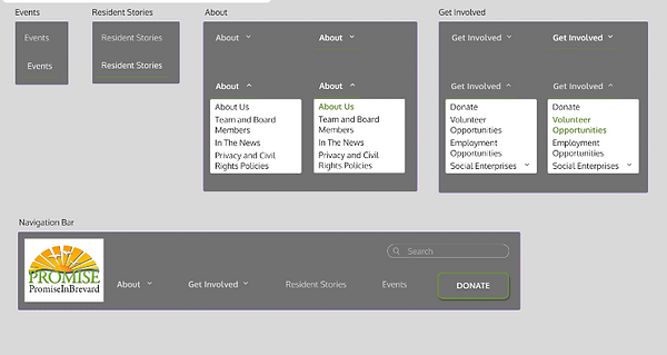
We wanted to make a navigation bar that made sense to the user. We did this by grouping all of the similar topics together and made drop downs within the drop down to make sure it didn't take up too much space right off the bar. We wanted to bring the user's attention to the donate button which is why it is different from the rest of the navigation.
Mobile Navigation

We used similar tactics when it came to the mobile navigation. We wanted to make it easy to use and even easier to find whatever the user may be looking for. We created dropdowns that fold open when the hamburger bar is clicked to minimize the amount of space it takes at the top of the screen when closed.
Icons

We wanted to make sure that all of our icons and buttons were within the parameters of our website in terms of both color, size, and typography. We wanted the user to not feel like anything was out of place and that it all ran seamlessly in terms of the display and usability.
Animations


We wanted to add movement within our website to add a sense of depth into it. We also wanted to create an atmosphere of fun that makes the website both interesting to use and look at. Which all increases user interest and interactions with the website.
We tested out our wireframes right after this and got both positive and negative feedback!
Moving parts makes the website Pop!
Usability Testing
Discarded part

We decided to discard this particular version of the campus gallery and later replace it. We came to this conclusion due to users stating that it was "too much to look at" and it also took up quite a bit of space within its page.
Discarded part

We discarded this particular design of the Team Member page. We did this due to users mentioning that the photos took up too much space and that it didn't quite match up with the rest of the website. We also did this due to the lack of space to put information about the members.
Final Deliverables
Website Version
This is the newest iteration of the Promise In Brevard website. We had changed the navigations, the layout, and much more to allow ease of access and encourage increased usage and engagement from users.
Mobile Version
This is the final mobile version of the Promise In Brevard's website. We wanted to capitalize on the amount of space the mobile allows. We did this through adjusting the way the visuals work such as making the navigation bar into a hamburger bar. We also adjusted the button and card size to accommodate the changes.
Original Design
Photo

Newest Design

Results and Impacts
The results of our redesign was increased user interest, and decreased user confusion when using the website. The amount of user engagement went up and we found that more users were willing to volunteer and donate to the Promise In Brevard nonprofit then before.
Challenges and Learnings
I learned the importance of having outside perspectives and user testing's within my project to help us find any inconsistencies and pain points a user may have. A challenge i found within creating this project was finding the best way to convert the original information from the website into the newer format without losing the essence of the website and the goals and aspirations of the CEO and residents.
Conclusion
Within this project we redesigned the Promise In Brevard's website. We changed many aspects including the layout and the organization of the navigation bar. We increased the usability of the website to allow more user interest to increase the foot traffic and volunteers to Promise in Brevard's Nonprofit.
Department of Education Redesign
Problem Statement:
The U.S Department of Education’s website
was difficult to navigate due to the amount of clutter, repetition of information and arbitrary links.
The Solution:
Emphasizing easy accessibility to information and simple navigation through minimal design and guided headers. Ultimately, the UI design is organized, simple and straightforward allowing the user to view its main contents with ease.
Scope, Role, and Tools:
We spent 2 weeks redesigning a portion of this website. My role within this projects was as a User Interface/Experience designer. The tools we used throughout the duration of this project were Figma and Miro. These tools were useful when it came to wireframing, designing, and collaborating and keeping track of our progress.
Project Overview:
We were given the task of redesigning a portion of the government website, The Department of Education's website. We focused on the finding and getting a loan section and the homepage of the website.
Goals and Objectives:
Our goals were to make the act of finding and getting a loan through the Department of Education's website easier and less confusing for users. We also wanted to increase the amount of users that the website sees while making the experience user friendly and engaging.
Research and Discovery
Research Methods:
We used Guerrilla usability testing to asses how users interact with the current design of the website. We also used usability testing with our prototypes and used a scenario to guide the user path.
Guerilla Testing

Share any quick iterations or improvements made based on guerrilla testing feedback. Through the guerilla testing, we learned that users were confused as to what steps to take to find loans. We also learned that many of the links go to the same page and the information was not set up in a comprehensive way.
Using guerilla testing helped us find pain points quickly!
User Persona

We created this user persona from the information we gained from the guerilla testing. We found a common issue of not understanding where to begin and what steps to take. We also found that most users using this site have similar needs when it comes to finding/applying to loans and grants.
User Path and User Sitemap
User Path:

We wanted to have a clear way for the user to navigate through the website and we came up with this user path. This gave us understanding to what portions we should focus on when it came to designing. This also helped our users during further testing to understand what the situation and scenario is.
Site Map
.jpg)
Research Methods:
We used this sitemap to plan out how we would create the connections between pages. This also aided us when it came to understanding the natural progression of a user through the website and how we can adjust it to increase usability while simultaneously aiding user enjoyment and understanding.
This helped use get rid of any dead ends!
Low Fidelity Wireframes
Website Wireframes

With this wireframe we wanted to make it easier to see all of the elements of the homepage and declutter. This was to make it easier to navigate and understand. We also wanted to organize the information in a way that users wouldn't get easily lost.
Mobile Wireframes

We wanted to find a way that maximized the limited space mobile devices allow while still keeping all the information the desktop website offers. so we implemented a hamburger dropdown for navigation.
We later adjusted the mobile to look more like the web version!
Visual Design
Colors

Explain how the visual design supports the overall user experience. We sourced our colors from the psychology of colors. We learned that navy blue and a light orange are associated with education and school. Our secondary colors were used for hover states, click states, and minor links.
Typography

When it came to typography we wanted to focus on ensuring readability. We settled on source serif pro to keep a feeling of professionalism while keeping the content easy to read and understand.
Button Styles

Similar to the typography, we wanted our buttons to be easy to read. We also wanted to make sure that users could quickly and easily identify what each button is for. We kept the buttons and icons rather simple to keep the feeling and tone of the pages consistent and easily identifiable.
Button States

We added hover and click states throughout the page. This was to help users understand/interact with our website. We also changed the hover and click states for the text to allow users to know when their cursor has crossed over a clickable item.
Graphic Patterns

These were small components we added to encourage the user to create an account or login to keep track of their information. We used these boxes to draw the user's eye.
Image Samples

We used these images as inspiration for the style and design of the pages we redesigned. We used the image of Dr. Miguel Cardona in our design since he is the secretary of education and is vital to the website. We also made sure to include the department of education's logo.
These images were a large part of our moodboard!
Prototypes
Website Prototype
Discuss any iterations made based on usability testing. We conducted some testing and found that setting up the information on the homepage without images would be more beneficial. We also found that sectioning the information to make it more digestable.
Mobile Prototype
We decided to keep most of the set up from the desktop version and transfer it into the mobile version. We made sure to assemble the information in a vertical way to make it easier to view.
Usability Testing
Discarded part

Hovering pop-ups were created for the navigation bar that detailed what was contained in the drop down menu below. After our usability testing, we realized that this feature caused confusion and took up too much space so we decided to remove this feature.
Discarded part

This was our original navigation bar with a light blue background. The color choice was covering the search bar, causing an inconvenience to the user. We adjusted it so it rests under the search bar.
Final Deliverables
Website Version
This is the current redesigns of the homepage and loan pages of the Department of Education's website. We changed the navigation and removed the unnecessary images that took up a large amount of space. We also updated the links to no longer be dead ends.
Mobile Version
This is the most current version of the mobile iteration. We based this off of our website version. The original version of the mobile application was extremely different from the
Original Design
Photo


Newest Design


Results and Impacts
The results of our redesigning of the homepage and loans page of the Department of Education website was an increase in user understanding. Another result was a decrease in user confusion and a related increase in user enjoyment while using the website.
Challenges and Learnings
A challenge we found when redesigning this website was within the navigation. We had some difficulty when it came to setting up the navigation to fit and match the rest of the homepage and other pages. This is where we really learned the importance of a style guide and a mood board to ensure our website has a consistent feeling and tone.
Conclusion
The overall objective of this project was to increase user interactivity and decrease user confusion. We redesigned the homepage and loans page of the website. We focused on making the information of the website digestible to the user and making the design more pleasing to look at and use.
We came to the conclusion to change the pop up that appears when a user comes across the care notes page that offers to translate the page. Users found that it was in the way of reading the document and popped up too often so we decided to make it a button rather than a timed pop up so the user can translate the page at anytime.